
Stop your AI website from looking like slop
Claude Code and other AI coding tools have made creating websites very easy in recent months. The effort required to create even a small website has reduced so much that you can simply give Claude a single, one-line prompt and a website will appear before your eyes in minutes.
The reality of AI-generated websites
While Claude and other AI tools definitely can make websites with very short prompts, they probably won't fit your brand as well as you'd like. You won't see the problem immediately, because your brain will be too blindsided by the speed the site was thrown together and how flashy and modern it looks. After a few hours or a day goes by, you'll realise something: it looks the same as the other AI-generated websites out there. The branding, structure and content might be different, but there's something there that just looks generic.
What you can do
There are plenty of skills on the internet, such as the frontend-design skill (opens in a new tab), that can help Claude design more unique websites. Instead, my approach is to use a bunch of statements in my initial prompt to Claude. This is similar to a skill but gives me control over which parts I can switch on or off for each site I make.
I'll be honest that Claude and other AI models do not always follow the prompt perfectly. Some sites will still end up being generated with the exact thing you told them not to do. This is a quirk of AI and not something shouting at the AI in all caps is going to fix.
My quick list of design tweaks for Claude Code
Do not use em dashes. This is the obvious one. Em dashes have been overused by most mainstream models for a while now (opens in a new tab). Simply asking AI to not use em dashes rarely works 100% of the time. It's not a huge problem to keep them in, but it's worth asking Claude to at least try to not use them.
Do not use eyebrow text, kicker or overlines over headings. These are the small lines of text commonly found over headings and titles. Usually found in the hero section right at the top of the homepage. Almost every one of the 8 websites I generated had one of these.
Do not use pills or badges. Pills and badges are the small button-like elements usually found in the hero section or under images to show bits of information like review counts or ratings.
Don't add unnecessary borders on cards. Another characteristic design choice AIs overuse.
Avoid purple gradients. AI doesn't do this as much as it has done in the past, but it's still a very popular colour choice for most AIs.
Don’t end sentences with trailing “-ing” phrases such as “, highlighting the importance of…”. This one is a personal pet peeve of mine. I like short, concise sentences.
Do not overuse emoji characters. AI tends to use emoji characters instead of icons. Sometimes it's better to just not use either.
Here's a copy-and-paste block. Remove any elements you like, then paste the block in the initial prompt box just after your own instructions.
Do not use em dashes.
Do not use eyebrow text, kicker or overlines over headings.
Do not use pills or badges.
Don't add unnecessary borders on cards.
Avoid purple gradients.
Don't end sentences with trailing "-ing" phrases such as ", highlighting the importance of...".
Do not overuse emoji characters.
Before and after
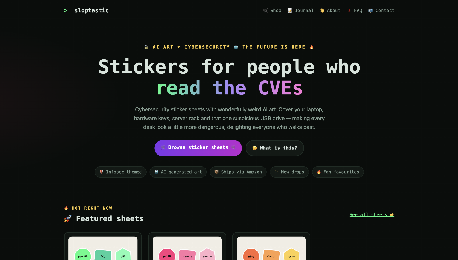 Before deslopification
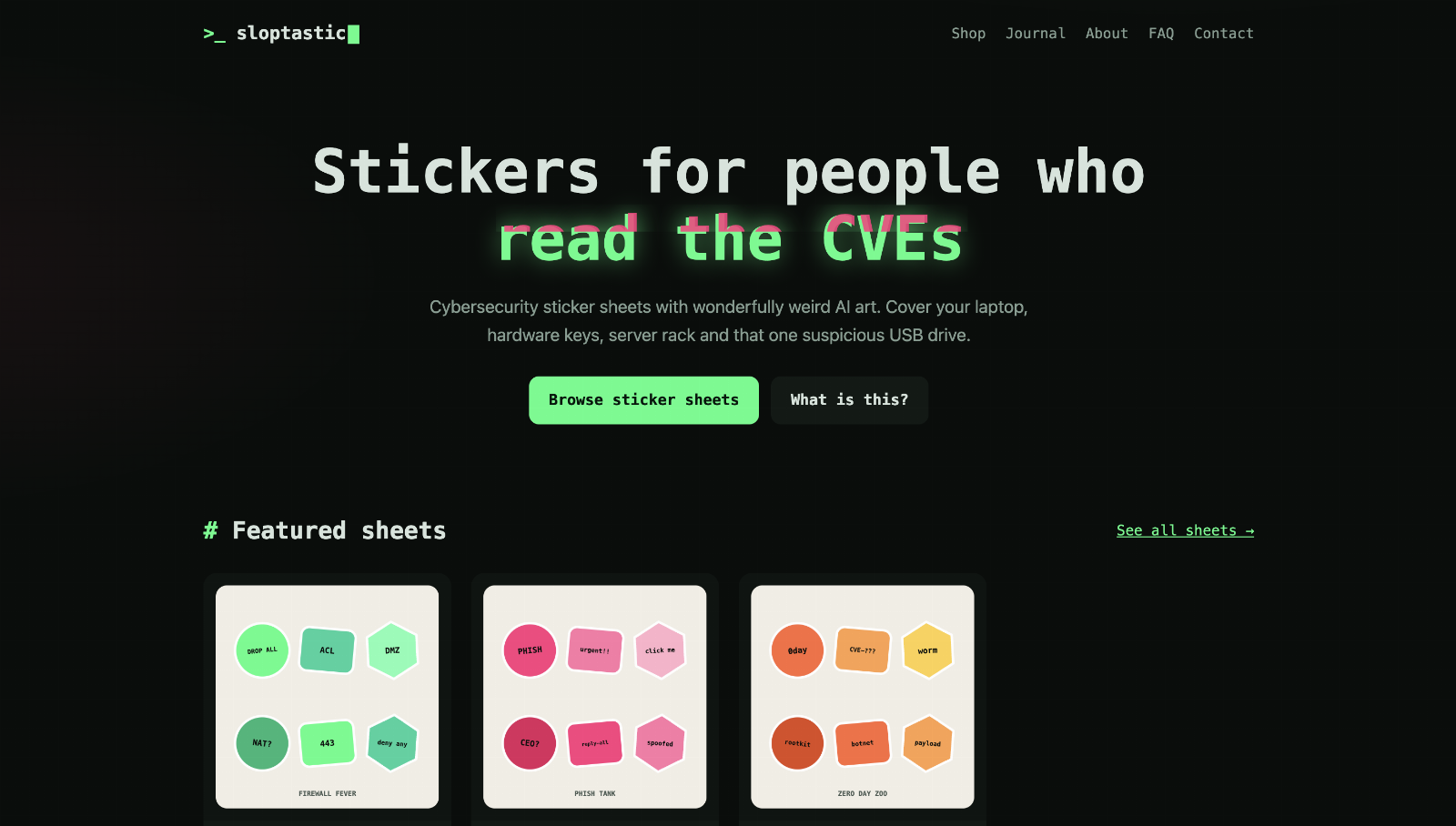 After deslopification
The site in both screenshots was made by Sonnet 5.5. I'll admit the change is modest. Notice that the overused emojis are gone, and the eyebrow text and pills are missing too. The first version also had a purple gradient and a border on the buttons. Reducing these makes the website feel cleaner without losing much of the design.
Why does AI design like this?
It uses these elements because they look good! In my opinion anyway. AI-generated websites rarely look bad. They just look generic. Websites made by humans are not perfect. They might have spacing issues, the colour might not look right, or the grammar or wording might not completely make sense. These are all quirks that give a website character and make them unique.
Building a website in Claude, Codex or any other AI tool makes the coding part easy, but it should still be you designing it. Give the AI more to work with. Explain what other sites you like and why. Give it direction on things you want. An AI-generated website can be unique if you spend some human time on it.
Sources
- Brent Csutoras, The Em Dash Dilemma: How a Punctuation Mark Became AI's Stubborn Signature (opens in a new tab), Medium, 29 April 2025 (the author has added updates since, the latest dated 5 October 2026).
Checked 26 October 2026.